Q2-45 : THRILLER PROJECT 2007/8
Friday, 14 March 2008
Q2-45 : THRILLER PROJECT 2007/8
Monday, 10 March 2008
Q2-45 : THRILLER PROJECT 2007/8
Extras
Me and terry went out of lesson and filmed some footage outside. We were trying to capture some running and distaughted images. Also trying to get some non-diagetic sounds for the thriller sequence. After we got this footage me and chris worked on making it into a section where the music takes a dramatic turn. We added a day to night effect to create a dark and misterious atmosphere. We also added the noise effect to go with the other sections where the music speeds up. The section that me and chris made also was put under the last couple of shots to make a distaughted image.
Labels: Louise H
Final opening sequence feedback
What is your favorite shot and why?
- The shot of the tap was very good because it leaves lots of questions.
- The egg shot was effective at engaging the audience.
- The tap shot, good close up, good effect
What is our thriller about?
We asked this question to see whether an audience would be able to guess what had happened and what it was about, overall people generally commented that they did not know but thought this was effective as it gets them asking a lot of questions.
What would describe the atmosphere as?
- Very tense, it was created very well from the music and random clips.
- The heart beat sound was very effective
- Very creepy and tense
- Achieves a sense of isolation and desertion
What shot would you remove and why?
Overall people suggested that we should remove the egg shot as it seems to random a shot compared to the deserted places. Another suggestion was to remove the flower shot as it was less effective and seemed out of place.
Labels: Terri V
Thursday, 6 March 2008
Q2-45 : THRILLER PROJECT 2007/8
The first rule of producing.....
...... is GET IT DONE!
So, therefore, I have spent the past few lunches (one with Lousie) working on the timeline, and... YAY it's all in the right place. So that saves one job for friday.
What still needs to be done:
- The soundtrack needs to be re-timed to fit with the footage, and then transfered onto the movie
- We need to add credits to the movie.
- We may need to cut down a few clips, but probably not.
Thats it.
Labels: Alice W-M
Wednesday, 5 March 2008
Q2-45 : THRILLER PROJECT 2007/8
Update on our current work
We are currently working on editing the footage to make it all the more eerie and empty looking, we are achieving this by making some shots darker and also adding a pinkish tint to some of the outside shots to make it seem as if the sun is just rising. In addition to this we are also adding a sepia tint to some of the inside footage to make it seem older. This has made our footage look more like a thriller movie and less like home-made footage.
We have got our slow footage in order and we are currently working on putting our fast images into the 2 or 3 second gaps. After this we will add titles and work on the transitions, and also add our finalised music.
Labels: Terri V
Diagetic sound
For our music soundtrack we needed to include more diagetic sound, so me and Louise went out with the camera to record sounds. We managed to get some banging sounds, movement sounds ie, running through leaves and also some crunching of plastic and metal. We plan to cut out the footage and just use the sounds to input into our music soundtrack.
In addition to this we will cut down our fast scary music clips into 2 or 3 seconds to fit in with our footage. Once we have done this we will add the sound track to the footage and make sure the timings go together.
Labels: Terri V
Rough cut feedback
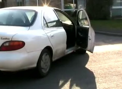
Our rough cut of our thriller project was not as good as we had hoped, as we encountered problems with editing the footage, although we managed to get enough cut and edited to fit in with our rough music, although it is not in order you can get a sense of what the final project will be like. You can see the sort of empty eerie shots, although we have not yet edited our flashing scary images so could not include them, hence why our footage does not yet match with the music.
We need to cut our shots down to a usable size and get them into an order, also we will need to adjust the lighting and add some effects to make the shots more effective to engage the audience. Our music is currently being adapted to fit the footage and also changed to make it more eerie and jumpy, we are attempting to add more of a climax to our fast music clips. In addition to this our short flashing images need to be worked on and adapted to fit in with our footage and music.
Labels: Terri V
Sunday, 2 March 2008
Q2-45 : THRILLER PROJECT 2007/8
Rough Cut Evaluation and What there is to be done
What worked well:
Although the rought cut was not an accurate replication of our final idea, it was still fairly recieved by other members of the class. I regret not coming to class on monday because if I had, I could have explained how the footage was arranged and an hour and a half worth of work could have been salvaged. However, we got some good feedback and useful things to improve on.
What still needs to be done:
Effects still need to be added to the clips to make them look more obscure and interesting. Also, a clip order needs to be finialised, and we need to arrange the clips in reference to the music. Some aditional filming may also be done.
Labels: Alice W-M
Tuesday, 26 February 2008
Q2-45 : THRILLER PROJECT 2007/8
Feedback to rough cut
1) How would you describe the visual style?
- eerie
- spooky
- sun rising looks good
- the egg, who's cooking it? if no one's about . . .
- props or settings - house, car, daffodil
- costumes - no characters or people
- performance - nothing really happened
- improvements - involve more things, leaves a lot of questions
Need to have lots of busy people etc before the 'noise' then show the emptiness.
leaves many unanswered questions, it does not give too much away and keeps the audience guessing!
5) How would you describe the mood/atmosphere of the opening?
- creepy/eerie/empty/deserted
- ? something where people have died? car crash?
- We liked the dripping noises at the beginning - creepy, emphasis the emptiness
- We also liked the heartbeat - adds tension/suspense
- nothing happens - empty scenes = mystery
- no characters
- people disappearing
- what's happened to the people? where are they? why the car has been left with an opened door
- make more sense
- connections between shots
- more narrative e.g. examples of why they are gone (possibly abstract)
Labels: Louise H
Our music soundtrack so far.
The music we included in our animatic and our rough cut is currently being changed to make it sound more eerie and empty, also in the short, flashing sequences we are going to make the music more climatic. We may also be adding a voice over of a television news report to give the audience a sense that something has gone wrong, also we may be adding some piano or slow violin music to the eerie footage to make it seem more empty and surreal.
Labels: Terri V
Sunday, 24 February 2008
Q2-45 : THRILLER PROJECT 2007/8
Filming
Although I did use the shot list, I added several shots and locations as additional footage, also some
shots were cut as they were unrealistic. There were a few problems with location, in that people were
actually about early on a sunday morning, and were in the shop I was filming, therefore they got in some
of the shots which meant that I had to wait a long time for them to move. Also, I could not do our original
idea of filming a static TV because it got lines on it and looked bad. If I had the chance I would have
shot in the summer so that it was lighter earlier and there would be less people around. I also would have
found more interesting places to take the shots from, and maybe changed some locations to be a bit more
shocking.I would have also not filmed when I was ill and when it was warmer, so that my hand wouldn't have
shaken as much.
Labels: Alice W-M
Monday, 18 February 2008
Q2-45 : THRILLER PROJECT 2007/8
Sound in our thriller
The main use of sound in our thriller is the music soundtrack, which chris and Terri have been working on. Although we plan to also include other sounds like, TV static and possibly diagetic sounds, we have yet to decide on, possibly something like a hand clap or a crisp packet being opened or something similar.
Labels: Alice W-M
Additional filming
Me and Alice started to film a couple more shots around Cambridge. Some were taken down by the train station and over the bridge. We took some shots of an abandoned building then some over the bridge where we found loads of little streets, so we took some at different angles. Down an ally way was another shot we took, this was difficult though as people kept walking by. After this we moved on and took some more like a cemetery and dark places which looked scary.
Labels: Louise H
Sunday, 10 February 2008
Q2-45 : THRILLER PROJECT 2007/8
Filming
It's now 8:44 on a sunday morning, I've been up since 6:49 filming empty roads and shops, which are surprisingly busy for a freezing cold day, especially a sunday. However, I did manage to get the empty A10, an empty village centre, and a few salvageable shots of shops, however there were a bunch of annoying meldreth-iens who found it nessisary to come and stare directly at the camera. After narrowly avoiding death by cold face, I came home to watch the footage, and some of it's useable, although the most of it may need to be thrown out because of cars and people wandering into shot. I have about 15 mins total at this point.
Labels: Alice W-M
Friday, 8 February 2008
Q2-45 : THRILLER PROJECT 2007/8
Names in a title sequence
I watched a selection of film title sequence and i realised something. i realised that longer names look better than shorter, although in real title sequences they cannot do anything about this we however can. for example instead of chris the name christopher looks more professional. also second names look better longer than the first. a few double second names also look good.
Labels: Chris H
Filming
Most of the filming we will be doing will be done during half term in Meldreth. After the shots are taken, we will review them and see if we need to re-shoot any of them.
Labels: Alice W-M
Monday, 4 February 2008
Q2-45 : THRILLER PROJECT 2007/8
Our Animatic (finally)
Finally completed after some troubles, unfortunately we were unable to include titles for now. Although as listed below we know what titles we are going to use. The music in our animatic seems to fit in well so far, although we plan to change the music to suit the footage more, as at first it appears a little too repeatative and eventually gets a bit boring.
Labels: Terri V
Storyboard Example

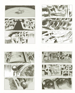

I decided to add this example so you can see what we are trying to achieve. Also it has some shots that we will be doing like the mouth shot and the long shots of rooms.
Labels: Louise H
Shot list
Arcanum
- Shot 1 - Side, long shot of a main road
- Shot 2 - Long shot of a village shop, zooms in on door
- Shot 3 - Medium close up of abandoned car
- Shot 4 - Extreme close up of a barbies eye then blinking
- Shot 5 - Long shot of a cul-de-sac
- Shot 6 - Medium close up of a front door of a house, zooms in on the door
- Shot 7 - long shot of inside hall, zooms in down the hall
- Shot 8 - Extreme close up of a hand with a peircing through it, flashing fast
- Shot 9 - Low angled shot of a tap which water is coming out of, then camera move up to a birds eye view
- Shot 10 - High angled shot on frying pan which zooms in
- Shot 11 - Close up of a vase of flowers slightly dying
- Shot 12 - Extreme close up of someone bitting their lips
- Shot 13 - Long left cornered shot of an empty living room with static TV
- Shot 14 - Long shot of upstairs hall way
- Shot 15 - Long shot of empty bedroom with clothes scattered across the floor
- Shot 16 - Extreme close up of a hip
- Shot 17 - High angled long shot of the garden from the upstairs bedroom window
- Shot 18 - Low left angled shot of three garages
- Shot 19 - Close up of abandoned bike
- Shot 20 - Extreme close up of a TV screen with the title on it
This may change as we shoot.
Labels: Louise H
Tuesday, 29 January 2008
Q2-45 : THRILLER PROJECT 2007/8
The Credits for our thriller
These are the credits, each lines is what will appear on a new shot:
Frank Waterman
Amanda Trough
John Keroscene
Benjamin Dover
With Teresa Richardson
Casting Designer
Nick Potamitis
Costume Designer
Clair MacKenzie
Original Score
Chris Hulme
Editor
Louise Housden
Director of Photography
Alice Walker
Story by
Mark Patterson
Written by
Philip Smithson
Produced by
Nigel Parker-Loose
Directed by
Terri Vineall
Life Films Present
Arcanum
Labels: Alice W-M
Saturday, 26 January 2008
Q2-45 : THRILLER PROJECT 2007/8
Font Styles
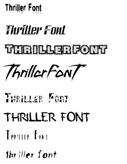
Here are some examples of font styles I thought might be good to use for our titles:
Labels: Alice W-M
Some more thriller intros
I thought I'd post some more thriller intros which I was inspired by, unfortunately the embedding wasn't working, so I've just given the links to you tube.
http://www.youtube.com/v/h5lbZCGrt4Y&rel=1
This is the intro to a movie called "Ginger Snaps". I think it's very effective because it immediately confronts the audience with some rather unsettling images of teenage girls pretending to kill themselves. The music mixes classical violins with a contemporary beat which underlays the mix of new and old which is continued throughout the sequence. During the sequence, we are introduced to two girls, although it their faces are not always clear until the end of the sequence when we see them in a classroom. The sequence consists mainly of pictures which are zoomed in or out of, or sometimes panned. These are spliced with small clips of the pictures being taken. It's set in a suburban looking house for parts, and a more traditional, sometimes Carrie-Esq house for other parts. Not much about the story is given away, all we find out is that there are two teenage girls who seem to have odd hobbies.
http://www.youtube.com/v/NG-Z6-nFQBo&rel=1
This is the start to a movie called "Swordfish". It's quite interesting because there are no titles or writing throughout the whole intro. We are introduced to a character, although we don't find out his name, we only hear and see him talk about Hollywood and films. He's the only person we see fully in the entire sequence. Mostly the sequence looks as though it's being shot through a hand held camera, however, it switches between this and more professional looking shots, for example the cigar being lit. We don't learn anything about the story or setting, because all we see is a gray wall, which doesn't give anything away. We don't really hear music, but there is a small, quiet classic sounding song in the background.
http://www.youtube.com/watch?v=xxgeH8InR9g
"The butterfly effect" is a psychological thriller, in which a man revisits his past through diaries he wrote at different times in his life. In the title sequence, the first thing we see it the chaos theory about how even a flap of a butterfly's wing can cause a tsunami half way across the world, we then see the main character rushing into a room, and writing a note. The room looks like an office, and the note he writes entices the viewer and makes them want to keep watching because they want to know who the "her" he's writing about is, and why he could be dead if someone finds the note. This then leads on to butterfly's flying around and scans of brains during which the title of the movie appears. This is all accompanied by some classical string and woodwind music, which builds suspense.
I chose these examples because they show how varied the thriller genre is, they are all very different movies, which would be put under the thriller genre.
Labels: Alice W-M
Friday, 25 January 2008
Q2-45 : THRILLER PROJECT 2007/8
Some locations which may be used


These are just some places near my village I thought might be good for our final piece. For example, empty train station, main road, shops, centre of my village, train line etc. I thought it might be a good idea because it will help us visualise the places more easily. I also made a video of a cul-de-sac which might be good.
Labels: Alice W-M
Feedback
-Be careful on roads and while frying egg, these could be dangerous
-Make sure it's not horror
- Check there are no people in the shots on location
-Good that we have no actors
-May have to do a lot of filters in final cut to keep it interesting
-Not clear name (good and bad)
-Make sure we know what location means in comparison to shots and props.
Pitch
Title : Arcanum
Plot: People are missing. Empty streets will fade slowly in, soft eerie music playing in the background to show the dead silence that has infected the world. we will then have loud, screeching, screaming music and flashes of disturbing and distorted. then cutting once more to the soft eerie scene.
Locations:
1: Empty road
2: post office
3: abandoned car (in road)
4: Eye
5: Cul-de-sac
6: Open door/lawn mower
7: hall way
8: Hand/arm
9: Bathroom tap
10: Frying egg
11: flower on table
Tuesday, 22 January 2008
Q2-45 : THRILLER PROJECT 2007/8
Examples of text in a film title sequence - Rudeboy
This is an example of the kind and amount of text found in the opening title sequence of a film. The film is Rudeboy.
Micheal White
presents
A Buzzy Enterprises Production
Ray Gange In
RUDEBOY
Starring
THE CLASH
Joe Strummer
Mick Jones
Paul Simonon
Nicky Headon
Written By
David Mingay
Ray Gange
Jack Hazan
Music By
Joe Strummer
Mick Jones
Produced And Directed By
Jack Hazan
David Mingay
From this i have learnt that there is a lot more names in an opening title sequence than i had previously thought. Also it has become aware to me that it is not in alphabetical order but instead in order of , i pressume, 'importance'.
I also looked at a variety of different title sequences to films. And they used the same layout. Starting with the company and then actors and the through to writers and producers. The music does not normally appear in most but it is an important part of this film. I have also noticed that the more famous people may have a shot to them selves where as with less famous people there may be a few names on at once.
Labels: Chris H
Test shots
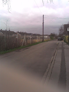
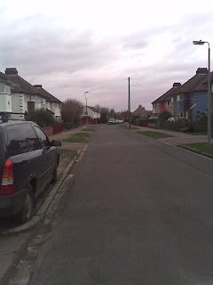
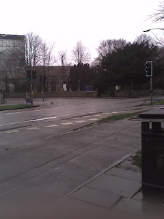
I been been walking around Cambridge looking for abandoned places. I found a couple of locations which are a church yard, cross roads, a housing estate and a road over looking a railway track. These are all different locations which we might add through out the sequence.
Labels: Louise H


